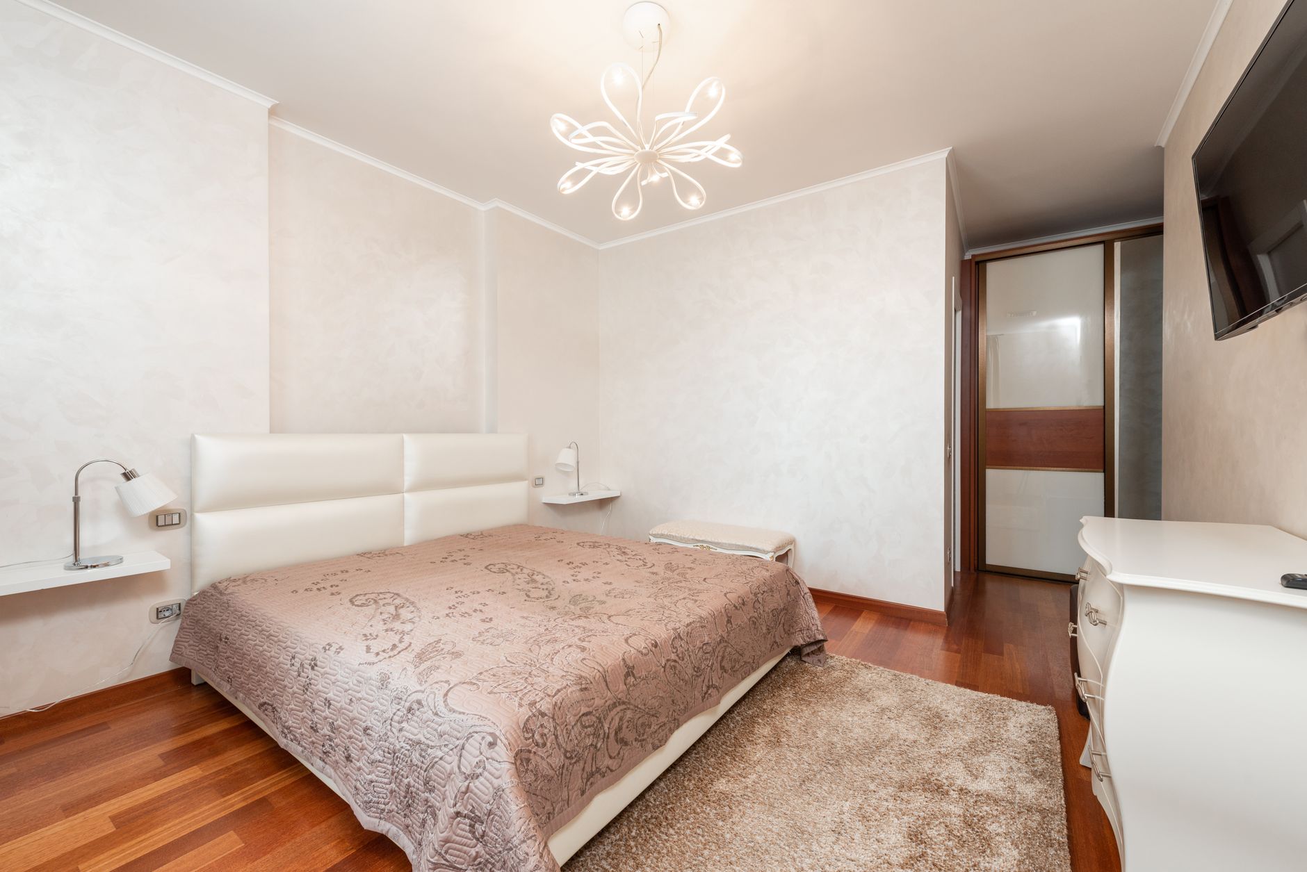
Walk into two rooms with the same square footage and one might feel like it could swallow the other. A narrow hallway stretches endlessly, a compact studio breathes effortlessly, and a café corner expands the moment you sit down. The difference isn’t just imagination—it’s perception, shaped by physics, architecture, and the brain working together.
How the brain measures space without a tape measure
The brain doesn’t rely on measurements. It conducts a constant visual audit, interpreting depth cues and the scale of familiar objects. When ceiling lines converge toward a vanishing point, floorboards narrow in the distance, or a window frame appears smaller, the visual system translates these patterns into a sense of spaciousness.
Design choices can amplify or mute these cues. A long, uninterrupted sightline reads as distance, while a broken one feels like confinement. Light acts as a ruler—bright, even illumination softens boundaries, while strong contrasts carve the room into smaller chunks.
Linear perspective—repeating lines like tiles or beams that tighten as they stretch away—signals extra depth. Occlusion, where one object partially covers another, creates layers, reinforcing the illusion of space beyond. Relative size also plays a role: familiar items like chairs or doors act as scale anchors. When they appear smaller, the brain assumes the room is larger. Texture gradients, like fine patterns that densify in the distance, further reinforce the expand-and-recede effect.
Light as a building material
Daylight isn’t just illumination—it has direction, weight, and structural logic. When light enters from one clear side, the room feels deeper, as the eye follows the gradient from bright to dim like a corridor. Multiple competing light sources can flatten the space, confusing the brain’s ability to gauge distance.
To make boundaries recede, architects and designers create a purposeful hierarchy. They lift the ceiling and upper walls while keeping peripheral corners calm. Small adjustments can have outsized effects. Pulling light across the long axis of a room exaggerates its length. Keeping the brightest patch off the floor and onto a vertical surface implies more wall beyond the room’s limits. Pale, matte finishes expand; saturated tones anchor.
Letting daylight skim along textures like linen or limewash adds depth without visual noise. Clearing the first meter of a window ensures the incoming beam feels uninterrupted. Brightness ratios and shadow softness complete the illusion. A room feels larger when contrast remains readable but not harsh. Soft-edged shadows suggest a distant light source, reducing the hard outlines that pin objects to walls.
Related: Winter Proof Your Home Pipes Now
Reflective surfaces and window treatments can fine-tune these ratios. More bounce on the ceiling increases perceived height, while controlled midtones prevent the far end from collapsing into gloom. The goal isn’t uniform brightness, which can feel flat, but a gentle, navigable gradient.
This approach isn’t just about aesthetics. The way light interacts with surfaces can make walls feel less like boundaries. A ceiling painted in a light, reflective color with nearby surfaces to bounce light upward creates the illusion of height. Avoiding deep black corners and maintaining controlled contrast keeps the space from feeling closed in.
Color and contrast: the psychology of pushing walls back
The eyes don’t measure square footage—they read value and saturation. Light values reflect more light, softening edges and reducing the points where a wall seems to begin. Darker values absorb light, sharpening boundaries and bringing surfaces forward. A pale, low-saturation paint can make a wall feel like it’s stepping back, while a richer, high-chroma color acts like a visual magnet.
The solution isn’t always “paint it white.” Instead, choosing a value range that prevents planes from announcing themselves too loudly works better. To visually expand a room, designers aim for a narrow value range across walls and ceilings, reducing hard edges and increasing continuity. Lower saturation on large surfaces keeps the space feeling calmer and airier.
High contrast is concentrated in small, movable elements like art or textiles. Thin, softened transitions at trim and corners reduce the “box” effect. A single large mirror or art piece can make everything else feel smaller by comparison, reinforcing the sense of openness.
Lines and geometry guide attention the way a well-composed sketch does—through direction, rhythm, and edges. A modest room can feel expansive when its lines lead the eye forward, upward, and outward without interruption. Clean sightlines act like visual highways, reducing obstacles and giving the mind a longer run-up to interpret depth.
Proportion acts as spatial grammar. When openings, furniture, and architectural elements share a consistent scale, the room feels intentional rather than crowded. Small misalignments or competing angles create visual noise, making a space feel tighter as the eye constantly reorients.
Related: How to help the burglar alarm security systems?
To make geometry work, designers align elements and repeat intervals so the eye can glide effortlessly. Extending a dominant axis—like a hallway to a window or a sofa to a fireplace—creates a clear destination. Repeating parallel lines, such as slats or shelves, adds momentum and calm. Aligning artwork tops, cabinet reveals, and rail heights reduces visual friction.
Using proportion as restraint—one oversized focal element instead of many small competing pieces—often reads as larger. Texture and detail management also play a role. Smooth, uninterrupted surfaces reduce visual noise, letting sightlines glide instead of snag. When walls, cabinetry, and large furnishings lean toward clean planes and subtle transitions, the brain spends fewer moments decoding edges and competing motifs.
The space feels more continuous than compartmentalized. This doesn’t mean the room has to feel sterile—just that detail is curated, not scattered. Concentrating texture where touch happens most, like a nubby rug or slatted wood detail, keeps the visual runs calm while preserving a sense of design.
Detail management is about controlling contrast frequency. Fewer abrupt changes in scale and motif make boundaries feel farther apart. A limited pattern set prevents the room from breaking into visual “tiles,” which the eye reads as smaller segments. To add depth without shrinking the footprint, designers layer textures that read as solid from a distance but reveal richness up close.
Matte finishes absorb and soften; satin reflects gently. High-gloss can expand when used in narrow accents but risks amplifying clutter if overused. The key is balance—enough variation to create interest, but not so much that the space feels fragmented.
What stands out is how little of this depends on actual size. A well-designed 300-square-foot studio can feel more expansive than a poorly arranged 800-square-foot apartment. The difference comes down to how the brain processes the space before a tape measure ever comes out.