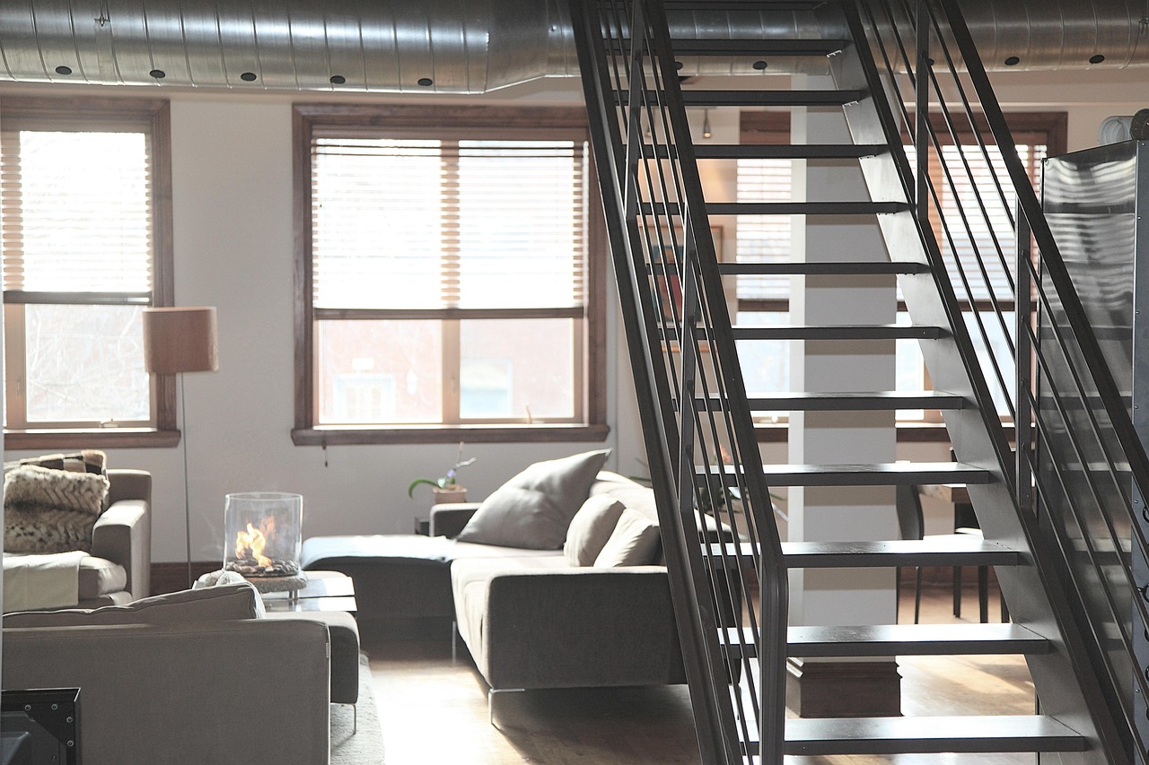
When a living room is painted bright yellow and turquoise, the space instantly feels lively; when the same walls are switched to soft gray and beige, the atmosphere turns calm. Designers often use that contrast to show how color choices shape a room’s mood.
How Bright Hues Change the Feel of a Space
A bold palette can make a room feel luminous and energetic. Using strong shades such as yellow, turquoise, red or electric blue adds visual punch and can encourage social interaction.
A living room dressed in yellow and turquoise, for example, radiates warmth that many find inviting for gatherings. Textiles, artwork and rugs in vivid tones act as focal points, drawing the eye and creating a sense of activity.
Neutral Tones Offer a Calm Backdrop
Neutral colors—beige, taupe, cream, soft gray or white—create a soothing environment that highlights furniture and textures. By keeping walls and large pieces understated, designers can layer textures like woven baskets, wooden accents or subtle metallics to add depth without overwhelming the senses.
Related: Cash Buyers Clear Hoarder Homes for Owners
Such rooms feel airy and spacious, making them well suited for quiet reflection or a retreat from daily busy life.
Both approaches rely on balance. A common guideline suggests a mix of 50 % neutral tones, 30 % bold colors and 20 % accent shades. Applying that rule might involve a gray sofa paired with bright yellow cushions and a few colorful decorative items, achieving cohesion while letting each element breathe.
Practical Tips for Mixing Color and Neutral Elements
When introducing bold colors, anchor them with neutral foundations like walls, flooring or large furniture. This prevents the eye from feeling overloaded and lets accent pieces pop.
Swappable accessories—throw pillows, artwork or rugs—allow homeowners to refresh a room’s look without a full remodel. Metallic finishes in gold or silver can add a modern twist to bright schemes, offering visual interest without competing with primary hues.
Related: Home Enchancment Ideas
Choosing the right accessories can steer the room’s vibe. Bright ceramics or whimsical art inject energy, while minimalist glass or simple pendant lights maintain a tranquil feel. The interplay of textures—matte versus glossy surfaces—adds another layer of sophistication that works across both colorful and neutral designs.
For occupants, the choice between a vivid or subdued palette often reflects lifestyle needs. A family that entertains frequently may favor lively colors to spark conversation, whereas a remote worker might prefer muted tones that reduce visual distraction.
Seeing the Same Room in Two Ways
Viewing a single space styled first with bold hues and then with neutral shades demonstrates how design elements can completely alter perception. The bright version feels active, encouraging movement and interaction.
The neutral rendition, by contrast, feels like a sanctuary, inviting calm and contemplation. Both versions showcase the power of color to influence how we experience a room.