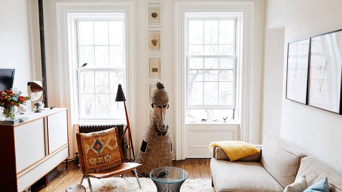
Why some spaces feel bigger is a question that blends physics, design, and perception, and researchers have identified a set of visual cues that shape our sense of room size even before we measure the walls.
Visual cues that trick the eye
When a ceiling line converges toward a vanishing point or floorboards narrow as they recede, the brain registers depth and interprets the area as larger. Light also acts as a ruler; even illumination softens edges, while stark contrast carves a space into tighter sections. Objects such as chairs or doors serve as scale anchors; when they appear smaller, the surrounding area seems more expansive.
Other cues include occlusion, where one object partially covers another, prompting the mind to stack layers and add a sense of “more space beyond.” Texture gradients, like finer rug fibers in the distance, reinforce the illusion of depth. Repeating lines—tiles, panels, or beams—that tighten with distance signal extra depth, while a broken sightline can feel confining.
Daylight and color as spatial tools
Daylight behaves like a building material with direction, weight, and hierarchy. Light entering from a single side creates a gradient that leads the eye from bright to dim, mimicking a corridor and enhancing perceived length. When light arrives from multiple angles, the space can appear flatter because the brain loses a dominant cue for distance.
Related: Smart moves cut energy bills for good
Designers often pull light across the long axis of a room, moving the brightest patch onto a vertical surface to suggest “more wall” beyond the frame. Pale, matte finishes encourage expansion, while saturated tones are reserved for focal surfaces. Keeping the first meter of a window clear of tall furniture allows the incoming beam to travel uninterrupted, reinforcing depth.
Brightness ratios and soft shadows also play a role. Soft‑edged shadows imply a distant light source, reducing the “hard outline” that pins objects to walls. Reflective surfaces increase ceiling bounce, adding perceived height, while a controlled mid‑tone wall prevents the far end from collapsing into darkness.
Color value and saturation further shape perception. Light values soften edges and lessen the “stop” points where a wall seems to begin, whereas darker values sharpen boundaries and bring surfaces forward. A low‑saturation paint on large surfaces creates an airy feel, while high contrast is best limited to small, movable elements such as artwork or textiles.
In practice, a narrow value range across walls and ceiling, lower saturation on expansive planes, and high contrast confined to accent pieces together lift the visual ceiling and push walls back, making the volume feel broader.
Related: Home Enchancment Ideas
Beyond light and color, geometry guides attention. Clean sightlines act as visual highways, reducing obstacles that force the eye to stop. When openings, furniture, and architectural elements share a consistent scale, the room reads as intentional rather than crowded. Misaligned angles create visual noise that tightens the perceived space.
Designers often extend a dominant axis—such as a hallway leading to a window—or repeat parallel lines like slats and trim to generate momentum. Consistent edge alignment reduces visual friction.
Texture management also matters. Smooth, uninterrupted surfaces act like calm water, allowing sightlines to glide without snag. Limiting pattern variety prevents the eye from breaking the room into small “tiles,” which the brain reads as smaller segments. Fine textures that appear denser in the distance reinforce depth without adding visual clutter.
One practical approach is to keep large planes quiet—minimal grout lines, low‑contrast flooring, and streamlined trim—while using micro‑textures such as linen weave or brushed metal in targeted spots. This balance lets the room breathe while still offering tactile interest.
Related: Why do I need professional air conditioning?
Humans have evolved to estimate distance quickly, using cues such as light, line, and texture to move through spaces safely. Modern interiors tap into those same shortcuts, deliberately shaping cues to make rooms feel more comfortable and navigable.
Light shapes perception profoundly.
Ultimately, the perception of spaciousness results from a choreography of cues—light, line, color, and texture—working together to guide the brain’s internal map. By manipulating these elements, architects and designers can create environments that feel larger than their square footage, enhancing comfort without expanding the physical envelope.